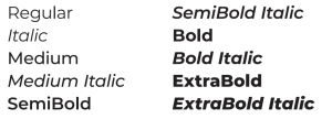
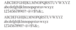
University Style Guide and Graphic Standards

The UNC Asheville Style Guide is the definitive reference for our visual identity. It covers the University logo, brand signature, color palette, typography, the University Seal, graphic elements, and design examples. All University communications materials must adhere to these standards.


UNC Asheville Style Guide

placeholder

UNC Asheville Style Guide

The UNC Asheville Style Guide is the definitive reference for our visual identity. It covers the University logo, brand signature, color palette, typography, the University Seal, graphic elements, and design examples. All University communications materials must adhere to these standards.

Download the UNC Asheville Style Guide


Typography

Our visual language relies heavily on typography. We lean on three typefaces, shown here, to achieve the correct look and feel.


Primary Typefaces

Denton

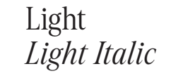
Denton is a warm and welcoming serif with a lot of character. It isn’t stuffy, but still feels academic. Our visual language uses only the Light weight of Denton and Denton Condensed, in regular and italic. The other weights may be used in certain instances, but the Light versions should be the primary fonts utilized.

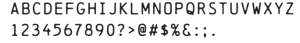
For on campus usage, a free alternative typeface is Playfair – https://fonts.google.com/specimen/Playfair


Accent Typeface

Chainprinter

In headlines and subheads, we use this subtle typeface sparingly. Typically, it’s an accent that we lean on for graphic elements, photo captions, and other call outs. Chainprinter should never compete for attention in the layouts where it appears.


Supporting Typeface

Monserrat

Montserrat is a readable, accessible, and flexible sans-serif typeface that we use primarily for body copy. It’s a great font for secondary messaging. It should never be used for headlines.

Montserrat

ABCDEFGHIJKLMNOPQRSTUVWXYZ
abcdefghijklmnopqrstuvwxyz
1234567890?>@#$%&:;.


Color Palette

Our palette has three layers: primary colors, earth tones, and vibrant accents. Our communications lean heavily on the primary palette; we use accent colors to add dimension and keep layouts visually interesting. For color floods, lean on primary colors. Use the earth tones for floods sparingly and use the vibrant colors only as accents.

Our signature Bulldog Blue should appear as the primary color in every marketing piece. This underscores our University identity and reflects our campus spirit.

This palette’s colors are inspired by the natural landscapes of Asheville. They can bring variety to marketing pieces while remaining true to the UNC Asheville brand. We use these colors only as accents; they should never be the dominant element in any piece. Using the monochromatic pairs (arranged here vertically) is a great way to tap into this palette’s potential.

These energetic colors can add a dash of color to layouts. They work well with the accent marks.

Using color is an easy way to evoke energy and emotion within our communications. Use this guide as a reference for incorporating color with restraint and consistency.

Of course, interpreting color is a highly subjective practice. There’s no mathematical formula for plotting our palettes on a chart like this. Use these groupings as an introductory guide and customize your choices based on your audience, intent, or medium.


Badges

Inspired by our history, our custom badges are part messaging and part graphic, making them a unique visual and verbal device in our toolkit. They act as accents or short messaging call-outs in all kinds of layouts.

New Badges

If there is a need to create more badges, please submit a graphics request form at ...

These badges can be updated with brand phrases that help tell the story being told in a material. Remember to keep simplicity in mind because space is limited. Within reason, you can adjust the spacing and size to better
fit your message.

If there is a need to create more badges, please submit a graphics request form at …


Athletics Logos

Use of all UNC Asheville athletics branding is subject to prior approval by the Department of Athletics. If you have questions about athletics branding or usage, please contact the University Licensing Administrator by emailing Dani Nicosia, dnicosia@unca.edu

UNC Asheville’s Bulldog graphic, commonly referred to as Rocky, is part of the official Athletics logo. This version of Rocky may not be used without express permission from Athletics.

Additional Bulldog designs are available for more general use, from Alumni Relations to campus communication, and may be customized to fit your project.

UNC Asheville’s Bulldog statues are also iconic, and for incoming and graduating students represent a symbol of good luck. Students give Rocky a good-luck pat before they start their first semester and again as they walk to Commencement, a favorite campus tradition.


Downloadable Resources

Find resources below to download and use for your own projects. If you have a need for a specific resource, please let us know!


Design FAQs

Many design programs are expensive to purchase, but it’s not necessary for your department to take on that cost. First, Communication & Marketing is available to work with you to iterate on professional, branded designs. We use the Adobe Creative Cloud suite of programs, including Photoshop, Illustrator, and InDesign, and can provide files to you in a variety of formats for distribution.

If you would like to start your designs yourself, use whatever tools are available to you in order to communicate most effectively. We understand that some departments may only have Microsoft Publisher, the Google suite, or Canva available to them; please know that it may be more difficult to create high-end documents in these programs, and Communication & Marketing may need to iterate with you in order to adequately brand your materials.

Many departments on campus look to promote events or groups in a short term, cost-effective way by printing fliers on campus. The Ricoh printers available to each department can print on standard letter- (8.5×11), and tabloid- (11×14) sized paper, and either of these should work for your needs. If you would like to print a larger poster, we can work with you to create a file and connect with a vendor.

Resolution refers to the number of pixels (or dots) per inch in an image. Standard definition screens operate at 72 dpi. Retina displays have a higher pixel density of 144 dpi. All printed material must be 300 dpi. Printing at lower resolution results in poor quality images.

CMYK and RGB are color profiles. CMYK refers to the commercial printing process and consists of values distributed among four ink colors: cyan, magenta, yellow, and black. RGB refers to screen display colors with color depth values distributed among red, green, and blue. RGB colors may also be defined by a hexadecimal code, which is commonly used in web design.

When developing print materials, all images and colors should be in CMYK. When developing material for the web or other screen display, all images and colors should be converted to RGB. Colors may look very different when converted.

Be sure that you have permission to use any image that you want to include in your materials or site. If your needs aren’t covered by Communication & Marketing’s photography or your own supply of photos and illustration, make sure that whatever image you want to use is royalty free and if not free to use, then something you have paid for. Images found on Wikimedia Commons or services like Unsplash are helpful.

See also:

We use and recommend QR Code Generator (https://www.qr-code-generator.com) for generating QR codes. You can easily enter your website to have it converted to a scannable QR code png file for free. You can change the color to Bulldog Blue or add simple frame designs using this app as well.

If your event or program is established as a campus tradition, such as Homecoming, Give UNC Asheville, Greenfest, etc, or is a named series or annual event, such as Visiting Writers Series, Parsons Lecture, etc., we can generate a dynamic QR Code for you that allows us to track the scans throughout the campaign. We can also add branding details, such as changing the color to Bulldog Blue, adding a simple frame, or adding a logo to the QR code.

We recommend including a listed url whenever a QR code is used for best accessibility. QR codes are recommended for using on printed materials, but are not recommended for digital materials since mobile users cannot scan codes when they’re already viewing on their phones!

That’s called bleed—as in designs that go to the edge of the paper bleed off the edge. Printing full-bleed is not possible on campus printers. If you’d like to print something the full size of your paper, the job will need to be done by a commercial print vendor. There are a number of vendors that UNC Asheville works with; please email communication@unca.edu for further guidance.